the challenge
Turn a complex set of requirements into a product experience that users could understand and navigate with confidence.
confidential product case study
A 0-to-1 product design project focused on translating complex requirements into clear workflows, scalable interaction patterns, and a cohesive product experience.
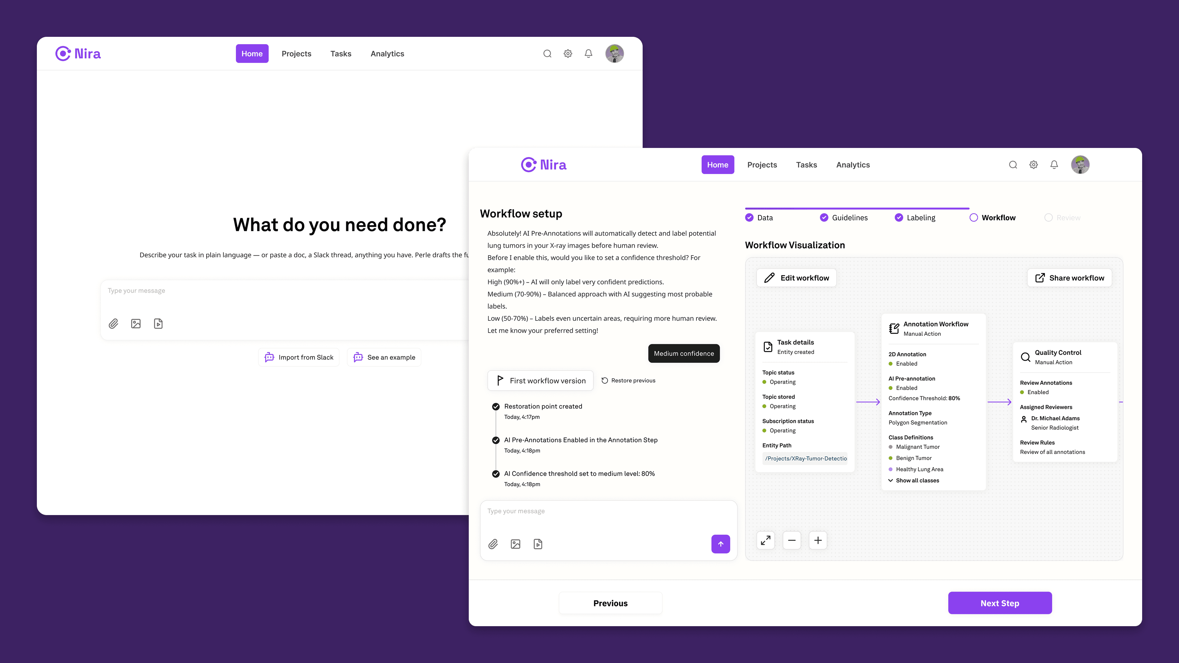
project overview
Turn a complex set of requirements into a product experience that users could understand and navigate with confidence.
Create an intuitive product from the ground up while establishing a foundation that could evolve as new functionality was introduced.
I worked across product thinking, information architecture, UX/UI design, prototyping, and design documentation.
Understand the problem space, define the product structure, explore workflows, design the interface, and consolidate recurring solutions into reusable patterns.
The product was being created from the ground up, which meant there was no established user experience or interface structure to inherit.
The challenge was to translate requirements and complex workflows into a product structure that would feel understandable to users while remaining flexible enough to support future development.
This meant thinking beyond individual screens from the beginning. Navigation, hierarchy, workflows, interaction patterns, and system behavior all needed to work together as part of the same product experience.
Complex B2B products often need to expose significant functionality without overwhelming the people using them.
The challenge was to determine what information users needed at each stage, which actions should receive priority, how different workflows should connect, and where the product could rely on reusable interaction patterns instead of isolated solutions.
The goal was not simply to design an interface. It was to establish a clear product logic that could guide the experience as the platform evolved.
How might we transform complex requirements into an intuitive product experience without limiting future scalability?
The early product mapping helped translate abstract requirements into tangible user flows, actions, states, and relationships between different parts of the experience.
By visualizing the system before focusing on interface details, I could identify dependencies, reduce unnecessary complexity, and understand where the same interaction patterns could be reused across multiple workflows.
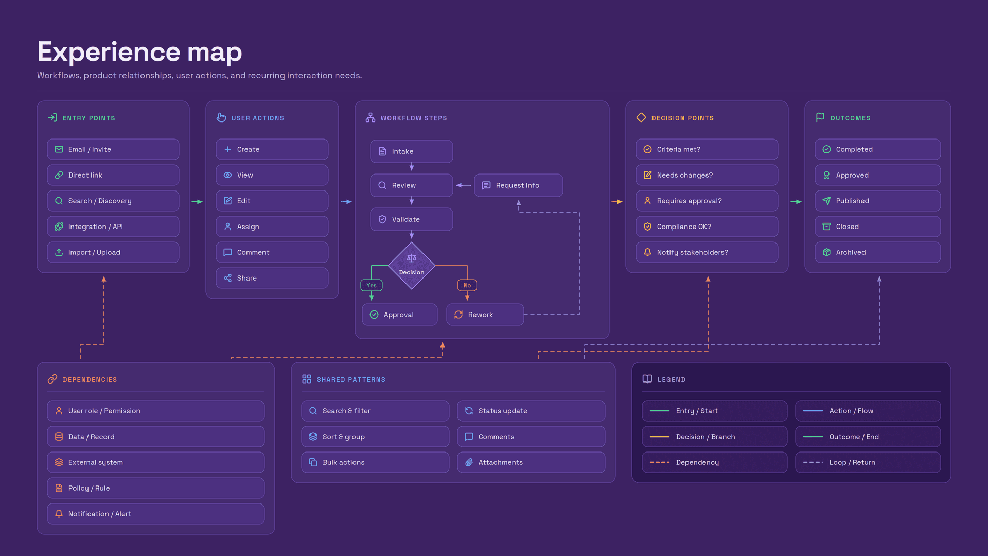
Mapping workflows, product relationships, user actions, and recurring interaction needs.
Before moving deeper into interface design, I established a small set of principles to guide decisions across the product.
The experience should make primary actions easy to identify, reveal complexity progressively, maintain predictable interaction behavior, and reuse patterns whenever similar problems appear in different parts of the product.
These principles helped prevent the experience from becoming a collection of disconnected screens as functionality expanded.
Every design decision should make the product easier to understand today without making it harder to scale tomorrow.
With the initial structure defined, I focused on creating predictable relationships between information, actions, navigation, and system feedback.
The objective was to reduce unnecessary decisions while giving users enough context to understand where they were, what they could do, and what would happen next.
Important information and primary actions should be recognizable without forcing users to scan the entire interface.
Similar actions should follow similar interaction patterns throughout the experience.
Advanced information and controls should appear when they become relevant instead of competing with the user's immediate task.
Early iterations focused on information architecture, workflow structure, hierarchy, and interaction behavior rather than visual detail.
Working at lower fidelity made it easier to explore alternatives, reorganize information, remove unnecessary steps, and establish the product logic before investing in polished UI.
The interface evolved as we better understood how different parts of the product needed to work together.
Key entry states were designed to establish context quickly and make the next meaningful action obvious.
Rather than presenting users with every possible option at once, the interface prioritizes the most relevant task while keeping secondary actions accessible without allowing them to compete for attention.
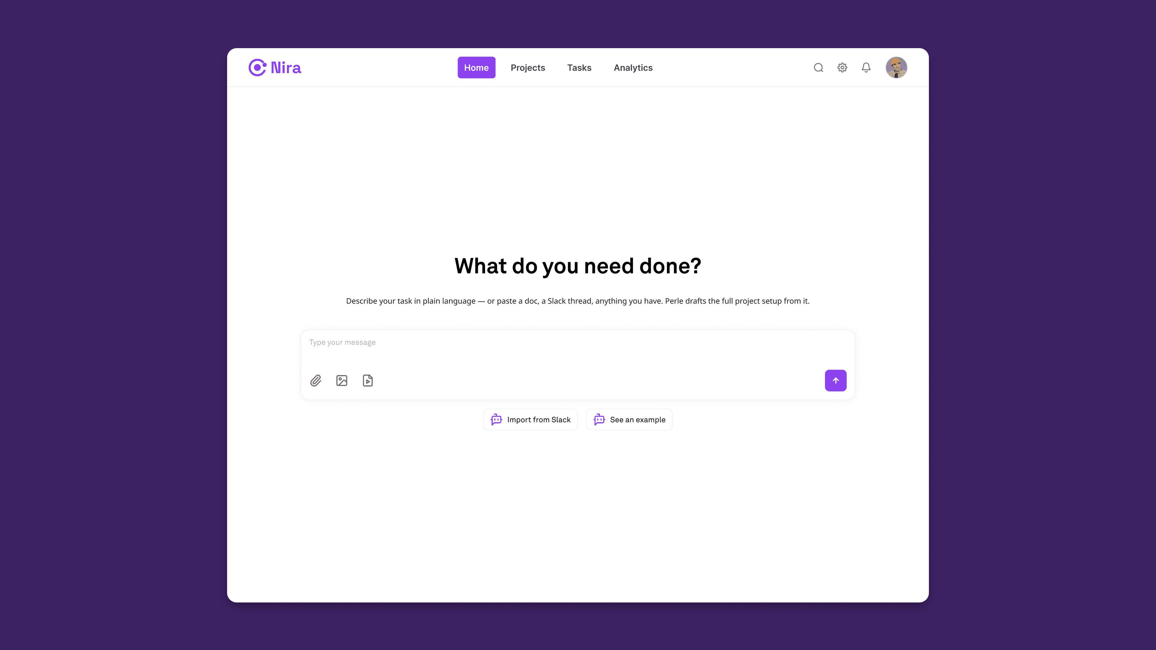
Clear hierarchy helps users understand context, available actions, and next steps.
Task-oriented flows were structured around clear grouping, predictable progression, and contextual information.
Primary actions remain visually dominant while secondary controls and supporting information appear where they are needed.
This reduces the amount of information users need to process at any single moment without removing the functionality required by the workflow.
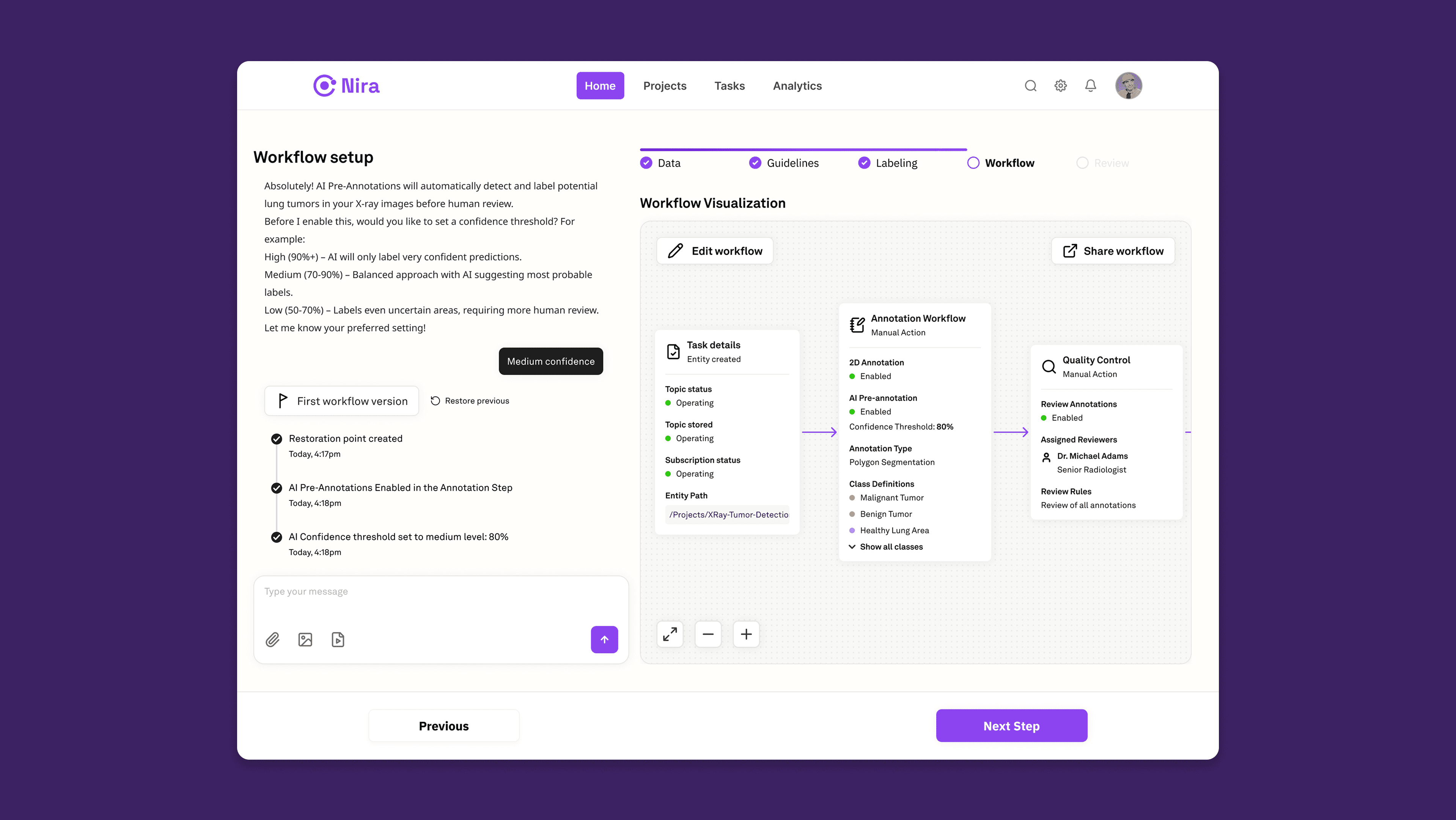
Complex actions are broken into understandable stages with clear system feedback.
Some parts of the product required users to work with significantly more information at once.
The objective was not to artificially simplify those interfaces by removing useful data. Instead, I used hierarchy, spacing, grouping, contextual actions, and progressive disclosure to make dense interfaces easier to scan and operate.
This allowed the product to retain its functional depth without making every piece of information equally prominent.
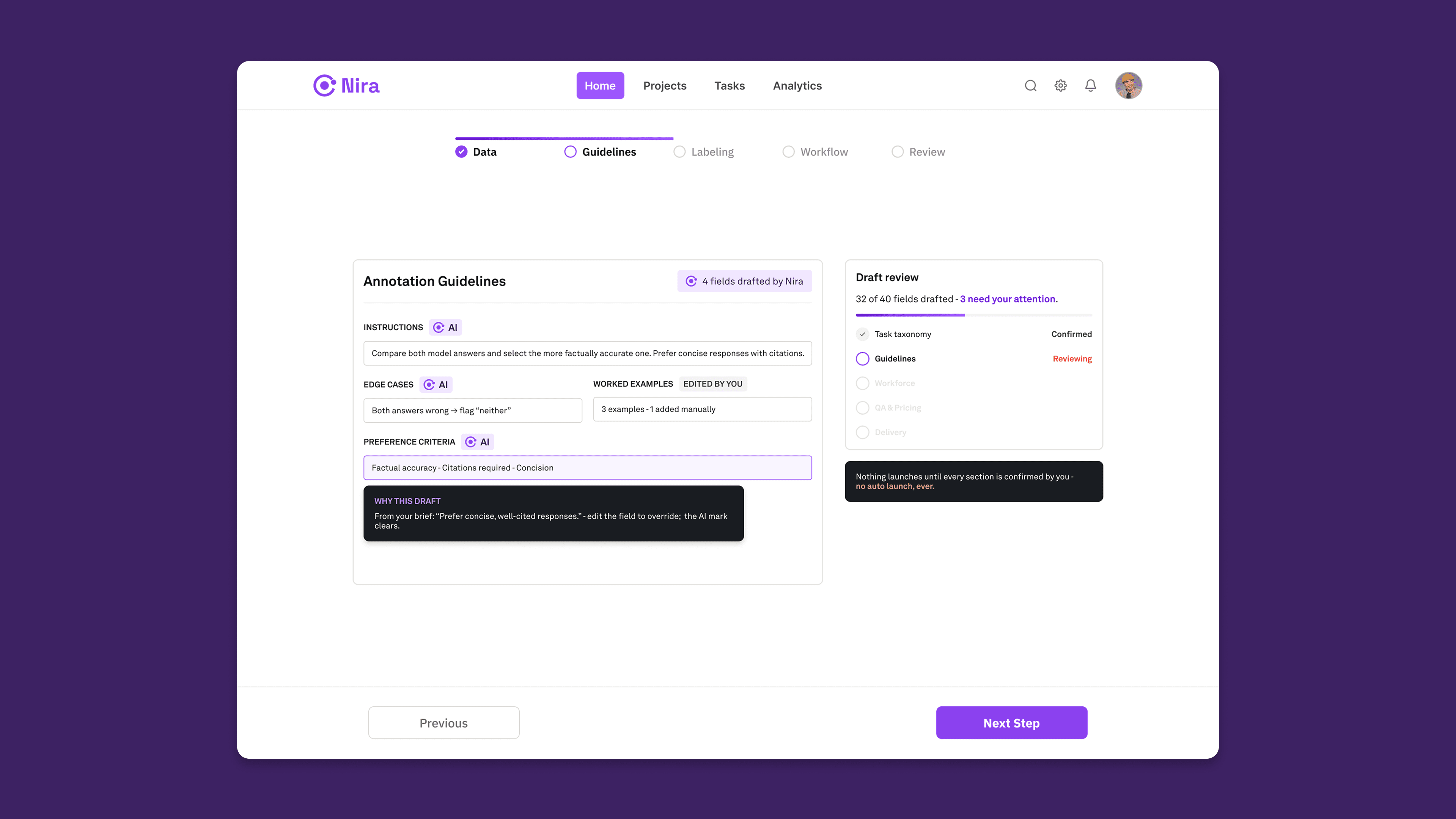
Information hierarchy helps preserve capability while reducing perceived complexity.
As the product experience matured, recurring solutions were consolidated into reusable components and interaction patterns.
Instead of solving the same interface problem repeatedly, common behaviors could be reused across different parts of the experience.
This helped maintain consistency while providing a stronger foundation for new functionality.
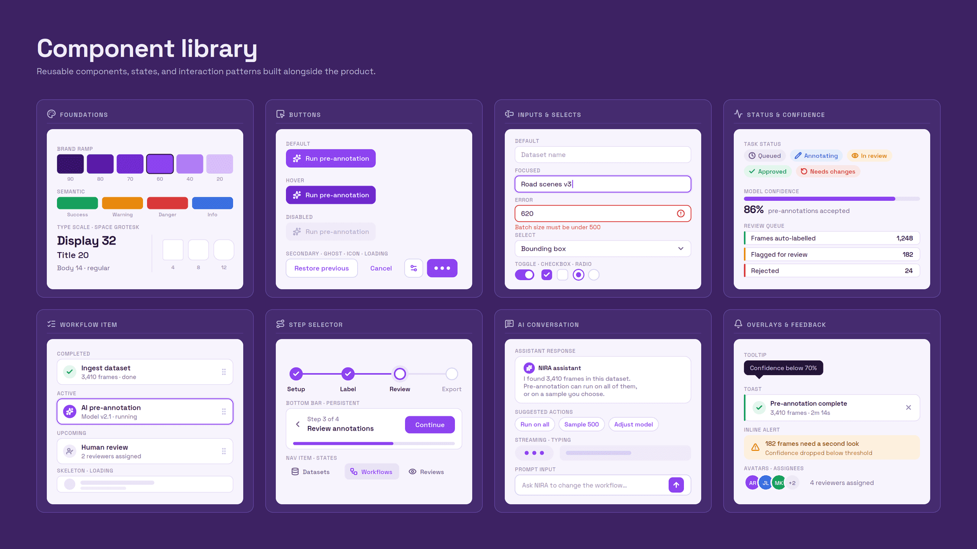
Reusable components, states, and interaction patterns created alongside the product.
Similar problems follow similar visual and interaction conventions throughout the product.
Reusable building blocks allow new interfaces to be created without relying on unnecessary one-off solutions.
Clear design rules make the product easier to maintain and evolve as new requirements emerge.
The project was not only about designing individual screens.
It was about creating a product language that could remain coherent as the experience continued to evolve.
System thinking became part of the product design process rather than something added after the interface was completed.
The work established both the initial product experience and a reusable design foundation that could support continued development.
Rather than evaluating the project through unsupported business metrics, the outcomes below reflect tangible design deliverables and structural improvements created through the process.
States, behaviors, components, and interaction decisions were documented alongside the design work, making implementation intent easier to communicate.
Core workflows were translated from requirements into structured, connected interfaces with clear hierarchy and interaction behavior.
Reusable components and interaction patterns created a consistent base for future product functionality.
A 0-to-1 product requires understanding how individual decisions affect the broader experience. Establishing relationships and rules early makes later design decisions significantly more consistent.
The most important early decisions were rarely visual. Defining hierarchy, workflows, states, and interaction behavior first created a much stronger foundation for the interface.
Complex products do not necessarily need fewer features. They need better decisions about when information appears, how it is organized, and what receives attention.
Reusable components become substantially more valuable when their intended behavior, states, and rationale are clearly communicated.
This project reinforced the importance of approaching product design as a connected system.
Starting from a blank canvas required defining not only what individual screens should look like, but how the product should be structured, how users should move through it, how interactions should behave, and how those decisions could remain consistent as the experience expanded.
The result was a product foundation designed to support both immediate usability and continued evolution.
Additional context about my process, design decisions, and responsibilities can be discussed during an interview.
Some project details are protected due to confidentiality. Enter the password provided to you to view this case study.